JoinIn Sports Mobile App Case Study
Skip the long articles and get straight to the essential sports takes in seconds.


Product Overview
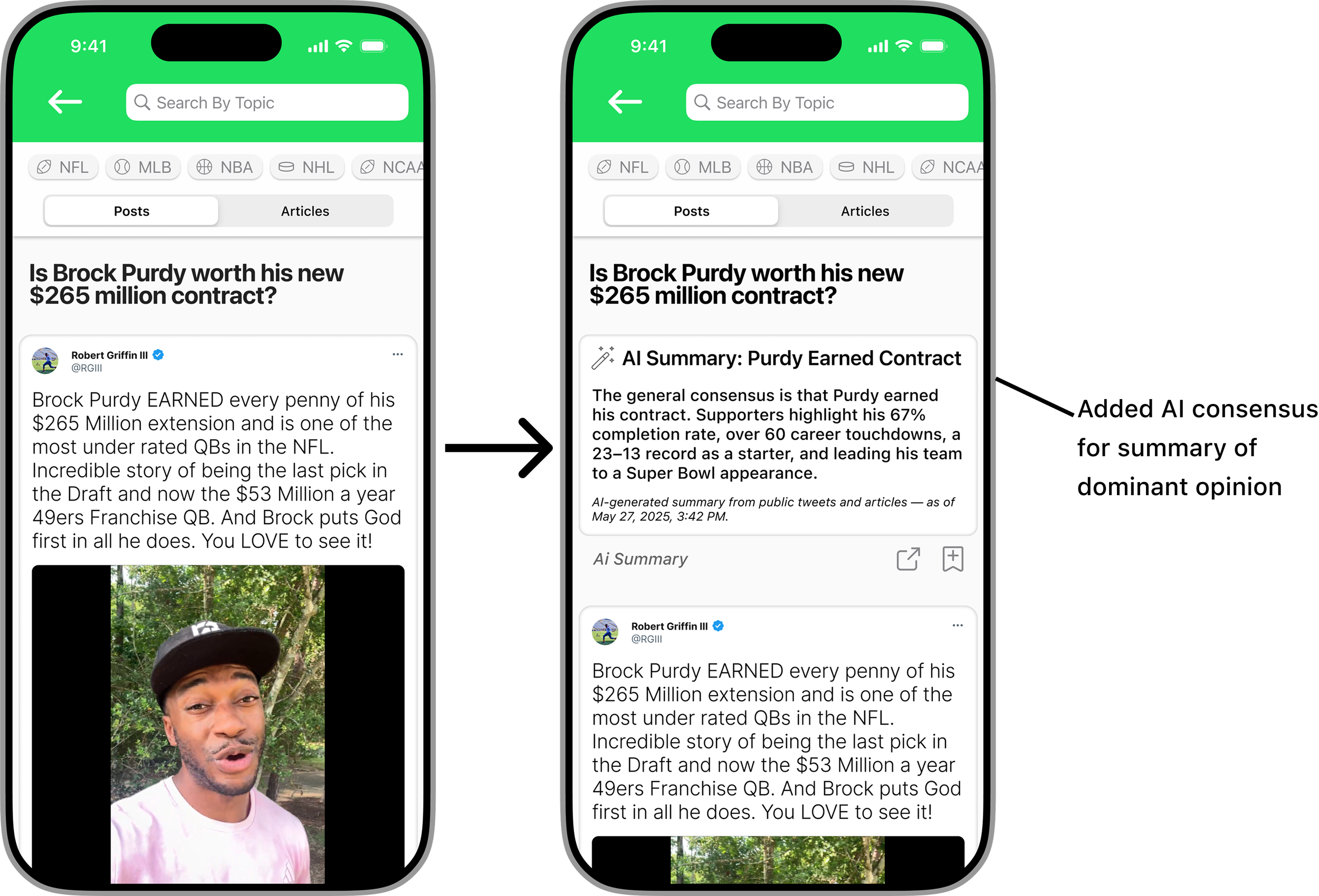
JoinIn is a sports conversation companion app designed for casual fans who want to stay in the loop on trending sports topics without deep research. Users can search or browse topics, see an AI-generated summary of the consensus opinion, and dive into curated tweets and article snippets. By saving content to a personal "cheat sheet," users quickly build confidence to join real-life conversations.
Platform
IOS/Android
Duration
2 Weeks
Role
UX Design, UI Design, Prototyping, Research
Tools
Figma
Problem
Many casual or non-sports fans feel excluded during conversations about specific sports topics because they lack quick and easy access to concise, relevant information. This often leaves them either admitting they’re out of the loop or staying silent. Although information is available online, it is typically overwhelming and time-consuming to navigate, making it difficult to quickly understand the prevailing opinions and key points needed to engage confidently in discussions.
Solution
JoinIn provides casual and non-sports fans with a simple, focused platform to quickly access concise, AI-generated summaries of trending sports topics. By curating relevant tweets and article snippets into an easy-to-navigate format, the app helps users grasp popular opinions and key points in under a minute — empowering them to join conversations confidently without the hassle of deep research.
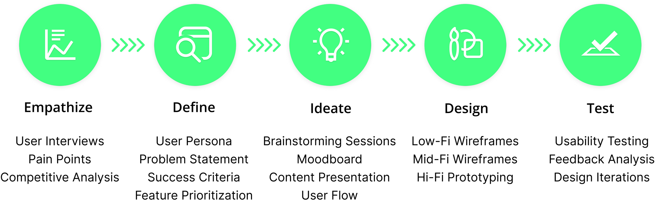
Design Process
The design process was key to building a fast, focused experience for users who want to stay in the loop without getting overwhelmed. Through user research, concept development, and iterative testing, I shaped a product that delivers clarity, confidence, and conversation-readiness in just a few taps.
User Interviews
Before beginning the design process, I conducted user interviews to better understand how casual and non-sports fans experience sports conversations. I spoke with individuals who often feel left out during sports-related discussions and asked about their current habits for staying informed. These conversations revealed common frustrations with long articles, overwhelming social media feeds, and the lack of a quick, reliable way to grasp trending topics and popular opinions—often causing them to give up on staying informed and miss out on conversations entirely.
Pain Points
Feeling Excluded: Users often feel left out of conversations because they don’t have in-depth knowledge of the sports topic being discussed.
Information Overload: When attempting to catch up, users are overwhelmed by long articles, endless tweets, and disorganized search results.
Unclear Talking Points: Users find it hard to identify which opinions and takes are most relevant or likely to come up in real conversations.
No Time to Research: Many users want to stay in the loop but don’t have the time or interest to dig through traditional sports media.
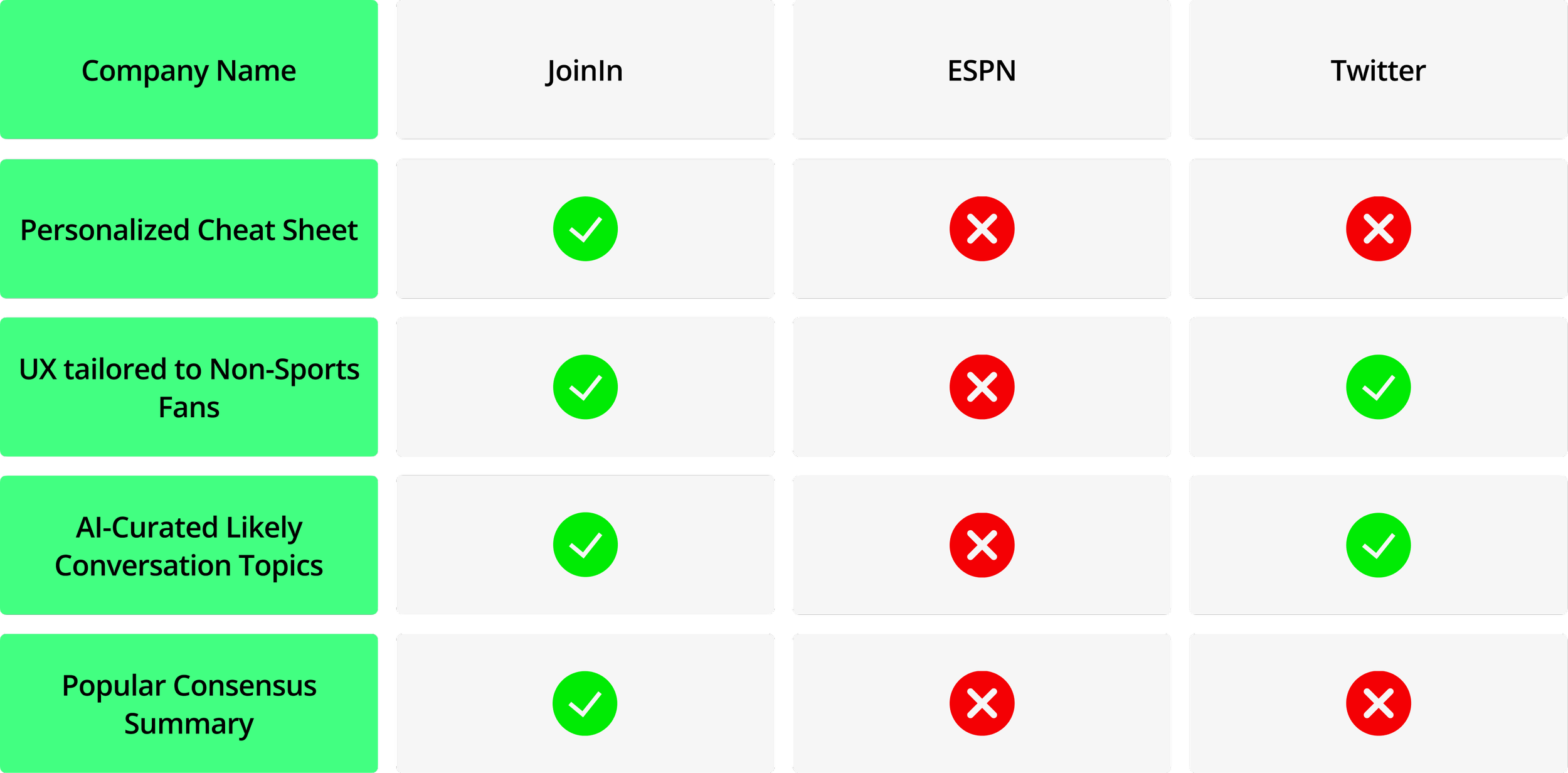
Competitive Analysis
This analysis compares JoinIn with leading platforms like ESPN and Twitter. Key features include a personalized cheat sheet, a user experience tailored to non-sports fans, AI-curated topics likely to come up in conversation, and concise summaries of public opinion. By evaluating these features, JoinIn reveals a clear opportunity to serve casual users with a faster, more approachable way to stay informed and join sports conversations confidently.
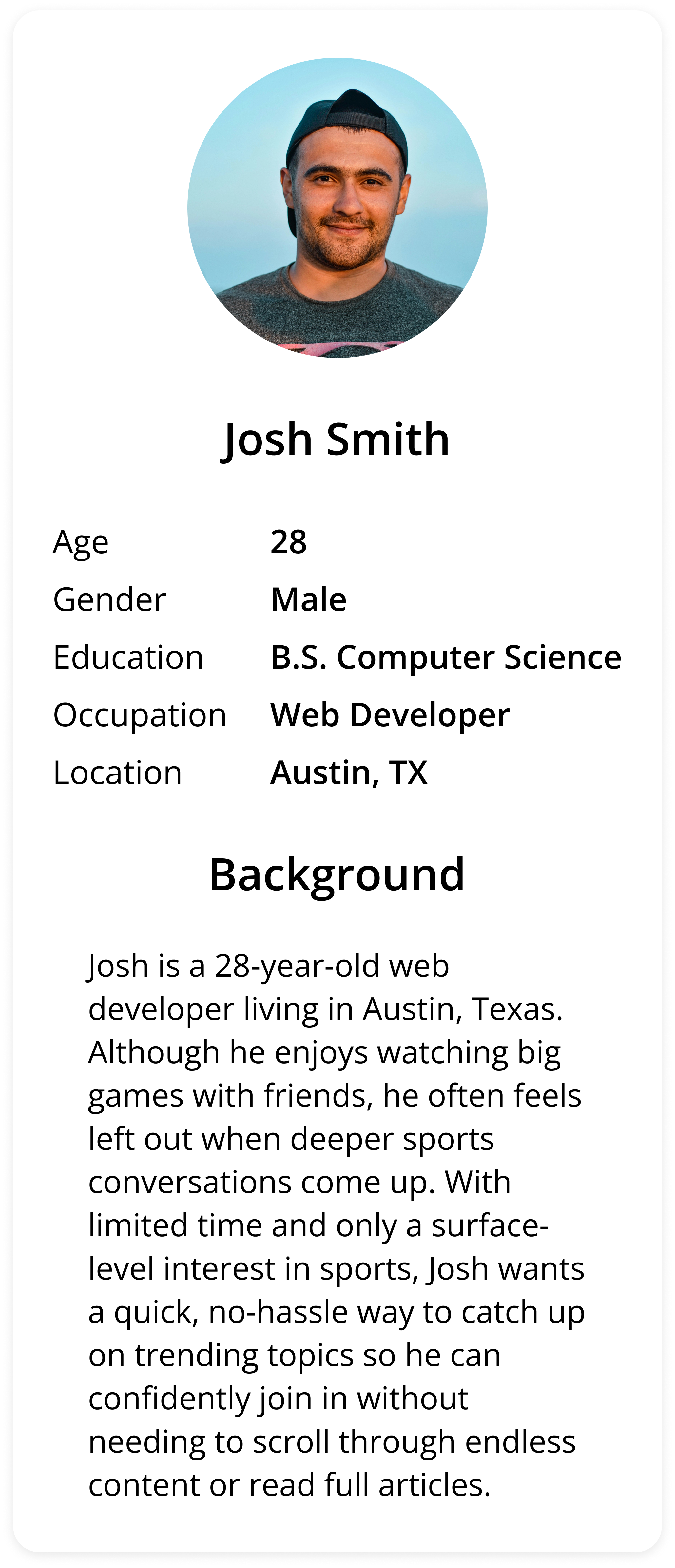
User Persona
The user persona section highlights a typical JoinIn user, offering insight into their social habits, goals, and frustrations related to staying informed on sports conversations. This persona shaped key design decisions to ensure the app delivered quick, relevant insights in a way that felt approachable and low-pressure.


User Empathy
The user empathy map reflects Josh’s experience as someone who enjoys being social but often feels excluded when sports come up. By understanding his habits, frustrations, and desire to stay informed without investing too much time, the app was shaped to help him confidently join conversations with minimal effort.
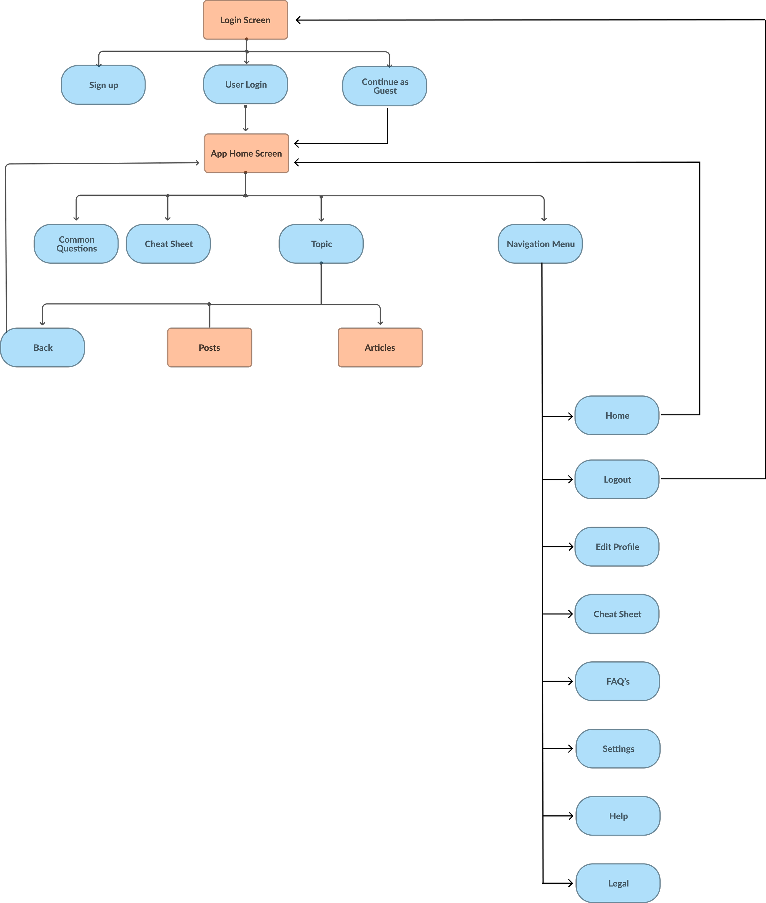
User Flow
This user flow represents the core journey within the current MVP scope. It highlights the key clickable paths that demonstrate the app’s main functionality, while non-functional elements are left without connecting arrows to reflect the limits of this initial version.
Colors Used
JoinIn’s color palette centers on a vibrant green (#20DE5F) that establishes an energetic and approachable tone. Neutral backgrounds from soft off-white (#FAFAFA) to crisp white (#FFFFFF) and subtle light gray (#F5F5F5) create a comfortable, readable interface with enough contrast to gently separate content. Text and icons use varying shades of black and gray (#212121 and #87878B) to establish hierarchy and focus, with darker tones emphasizing primary navigation elements for clear recognition.


Typography
The app uses SF Pro, Apple’s system font, to create a familiar and comfortable experience for iOS users. Font weights and sizes like Bold 24 and Medium 16 establish hierarchy and support easy scanning. In addition, Times New Roman is used in article snippets to give a more authentic, editorial feel.
Times New Roman
This is an example of Times New Roman font style
SF Pro
This is an example of SF Pro font style
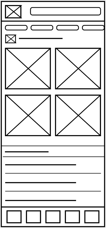
Low-Fidelity Sketches


Wireframes


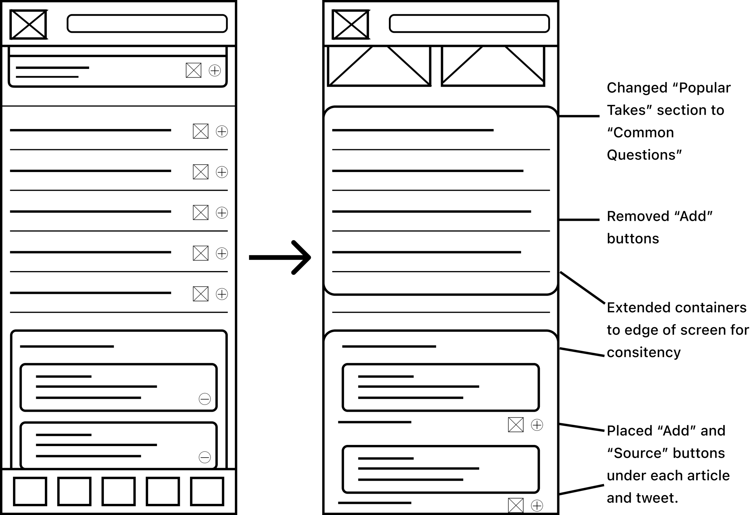
Wireframe Iterations

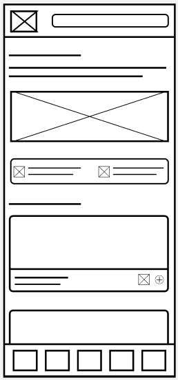
Hi-Fidelity Mockups


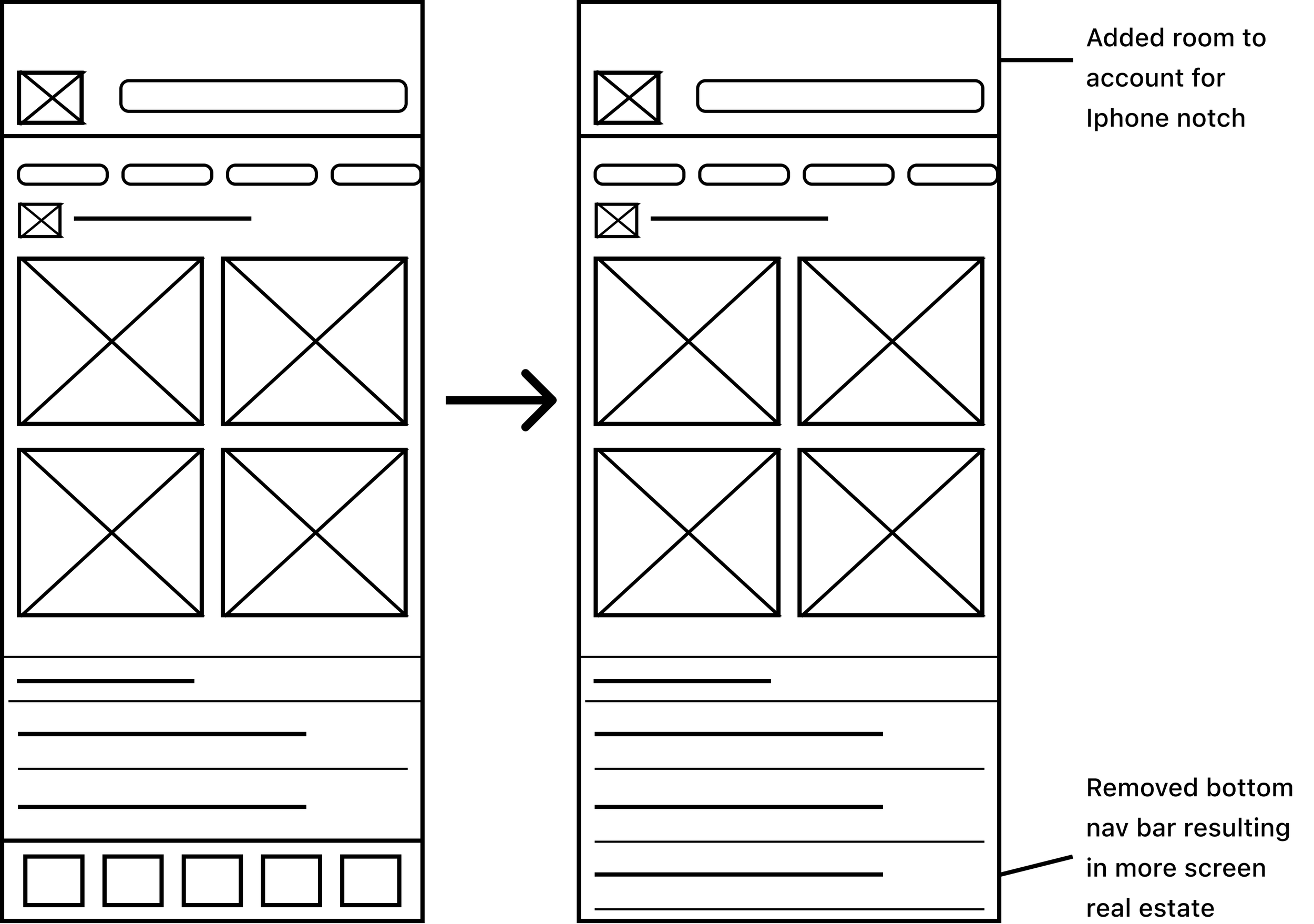
Hi-Fidelity Iterations

Conclusion
Designing JoinIn challenged me to create a straightforward, approachable experience for users who often feel left out of sports conversations. This project deepened my understanding of simplifying complex topics through UX, and reinforced the importance of familiarity, clarity, and visual hierarchy. Moving forward, I plan to continue refining the experience through targeted user testing and explore new ways to personalize content without overwhelming the user.